Table of Contents
- Content Cluster Strategy for Travel SEO and Conversion
- 30-Day Implementation Plan
- Common Mistakes and Direct Fixes
- FAQ
Travel websites are naturally visual, but visual quality alone does not generate reliable bookings. Users compare itineraries, policies, and trust signals quickly, especially when trip budgets are high. If the page is beautiful but operationally unclear, they leave to compare another agency.
That is why browsing examples is only the first step. The real value appears when your team converts inspiration into repeatable page structure, clear messaging, and measurable conversion flow. Without that translation layer, teams end up collecting references while production quality stays inconsistent.
In 2026, the highest-performing travel sites share a practical pattern: specific positioning, credible proof, transparent package logic, and low-friction next steps. They guide users from discovery to confidence to inquiry without forcing people to guess what happens next.
This guide breaks down how to build that system. It is written for travel agencies, tourism operators, and in-house marketing teams that need pages to perform commercially, not just look polished.
sbb-itb-bf47c9b
Quick Strategic Takeaways
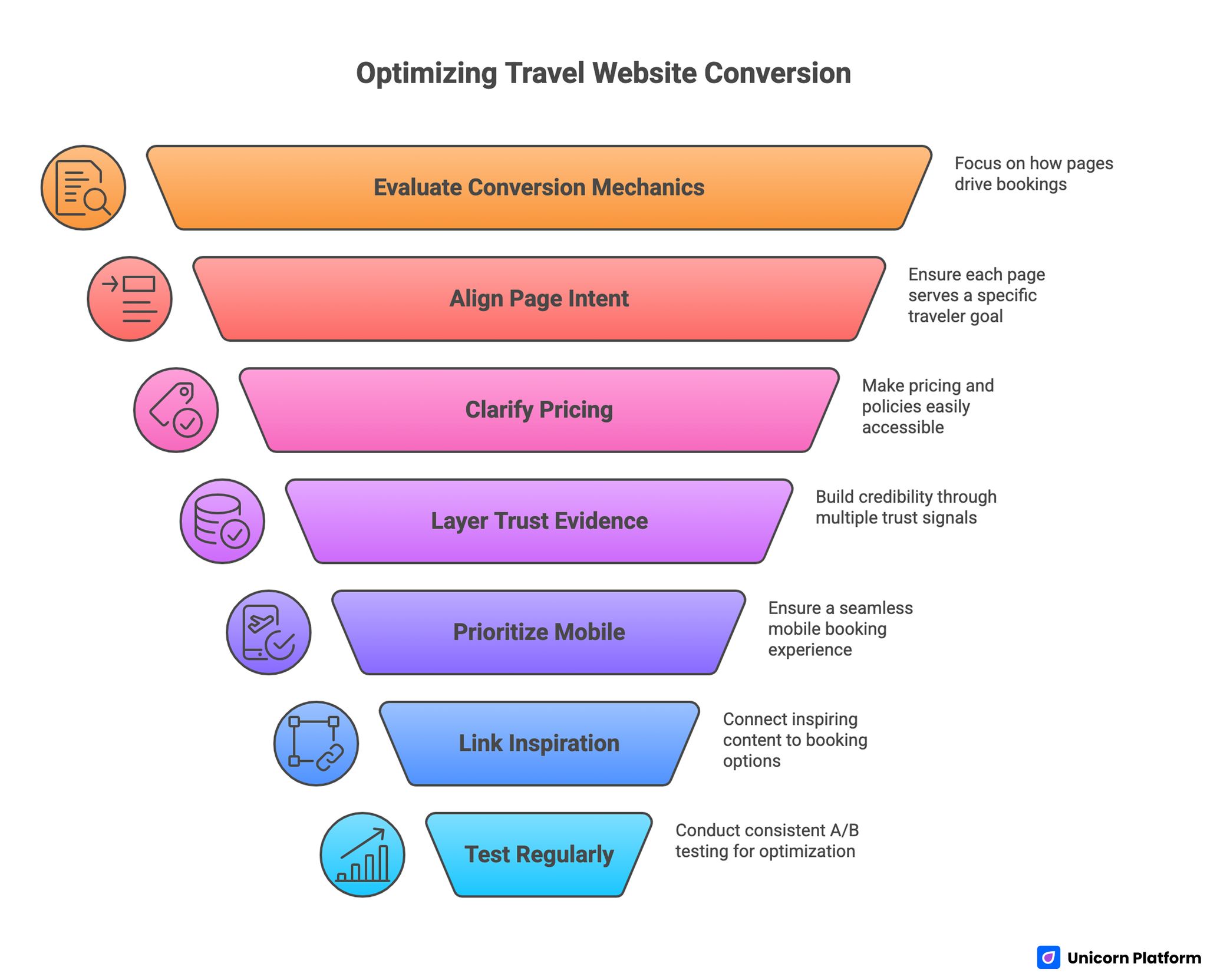
Optimizing Travel Website Conversion
- Evaluate examples by conversion mechanics, not just design style.
- Build each page around one traveler intent and one primary action.
- Put pricing logic, inclusions, and policy clarity closer to the first CTA.
- Use trust evidence in layers instead of one testimonial block at the bottom.
- Keep mobile booking and inquiry flow as a top-level product priority.
- Connect inspiration content to package pages through structured internal links.
- Run weekly tests with one variable per experiment to preserve signal quality.
Why Example Lists Are Helpful but Incomplete
Inspiration roundups can accelerate ideation. They show visual direction, layout variety, and interaction ideas that might not emerge from internal brainstorming alone. They are useful inputs for teams defining a new brand direction or redesigning an outdated travel site.
The limitation is that most roundups emphasize aesthetics over performance mechanics. You can see typography choices and hero treatments, but not the operational details that influence inquiry quality, booking starts, and downstream close rates.
That gap matters. Travel pages operate in a high-consideration category where users need confidence on logistics, safety, price scope, and policy terms before they commit. If those details are weak or delayed, conversion drops even when visual style is strong.
A Practical Evaluation Scorecard for Travel References
Use a simple scorecard when reviewing any travel site example. This prevents subjective design debates and keeps decisions tied to business outcomes.
Score each page from 1 to 5 across these categories. Keeping the scale fixed across all examples makes comparisons much more reliable.
- First-screen clarity: audience, destination, and value promise
- Package comprehension: itinerary, inclusions, and difficulty context
- Price transparency: clear ranges, tiers, or quote expectations
- Trust signals: reviews, credentials, and operating confidence markers
- Action clarity: obvious next step and commitment expectation
- Mobile usability: speed, readability, and tap-friendly interactions
After scoring, prioritize patterns that improve at least three categories simultaneously. This helps teams avoid chasing isolated visual features that do not support conversions.
Start With Traveler Intent, Not With Layout
Page architecture should start from traveler intent. Different visitors arrive with different planning stages and risk sensitivity. A single page cannot serve all intents equally well without reducing clarity.
Common intent segments include the groups below. Each segment needs a different balance of education, reassurance, and urgency.
- Destination discovery: users exploring ideas and seasonality.
- Package comparison: users evaluating itinerary details and value.
- Decision-ready inquiry: users choosing dates and confirming logistics.
Each segment needs different message emphasis and proof order. Discovery pages should reduce uncertainty and educate. Comparison pages should highlight differentiators and pricing logic. Decision-ready pages should remove booking friction and strengthen trust near the action module.
Page Architecture That Improves Inquiry Quality
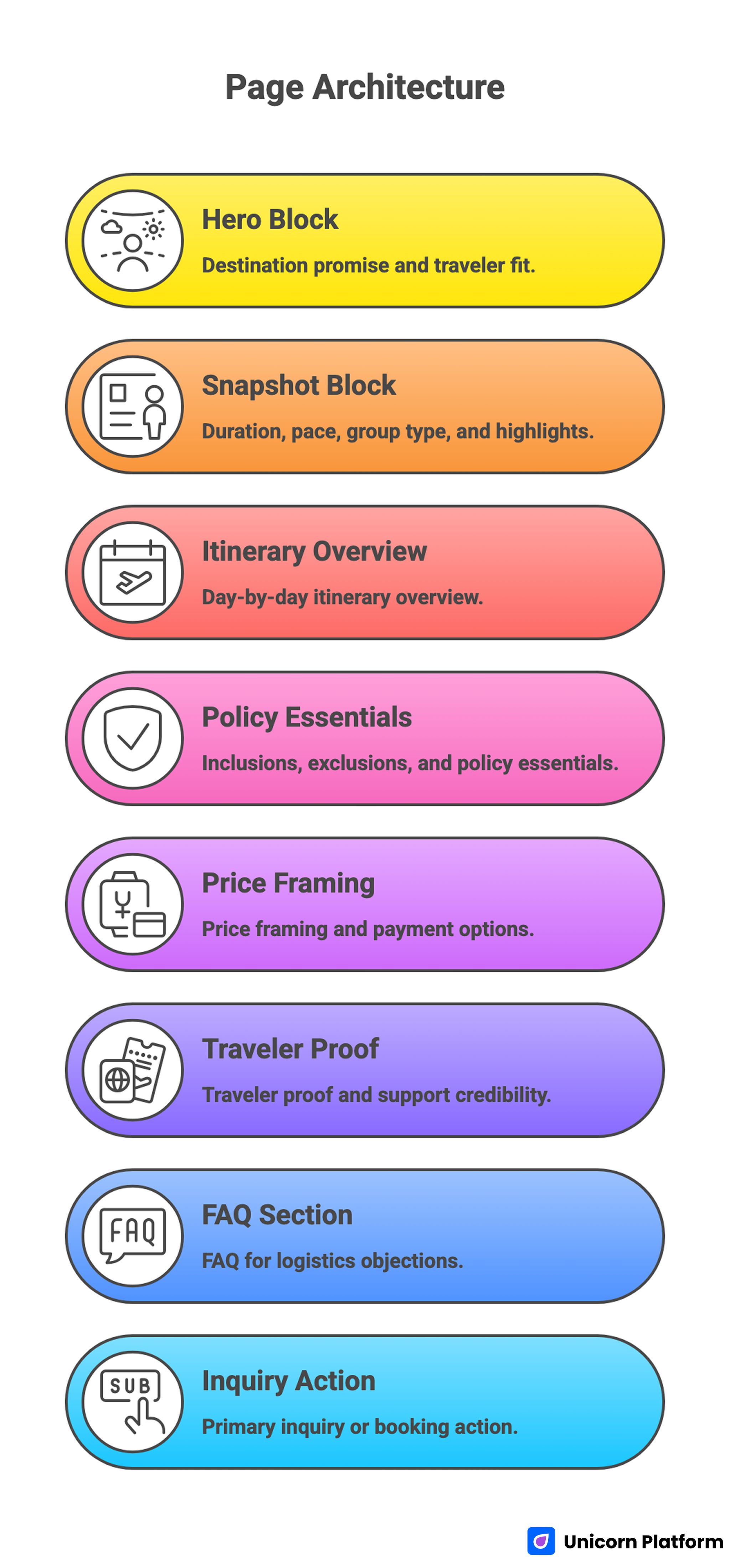
Page Architecture That Improves Inquiry Quality
Most travel teams perform better with a stable structure that can be reused across destinations. Reusability reduces production time and makes optimization data easier to compare.
A practical page sequence is listed below. Use it as a baseline and adapt messaging by route and traveler type.
- Hero with destination promise and traveler fit
- Snapshot block with duration, pace, group type, and highlights
- Day-by-day itinerary overview
- Inclusions, exclusions, and policy essentials
- Price framing and payment options
- Traveler proof and support credibility
- FAQ for logistics objections
- Primary inquiry or booking action
If your team wants a larger benchmark set for this exact category, this collection of travel agency website examples for tourism brands is useful for comparing structural choices across different operator models. Reviewing multiple examples side by side helps teams separate style preferences from proven conversion patterns.
Stable architecture does not mean generic pages. It means consistent decision flow, so users can evaluate offers quickly while content stays destination-specific.
Hero Design: Emotional Pull Plus Operational Clarity
Travel heroes should inspire without becoming vague. A cinematic photo can attract attention, but the copy must still communicate practical relevance in seconds.
Strong heroes usually include four elements: destination context, traveler profile, trip style, and immediate next action. For example, a family-friendly cultural itinerary needs different framing than a technical trekking route.
Avoid broad phrases that could apply to any trip. Specificity improves trust early and lowers bounce from users who cannot confirm fit quickly.
Package Detail Design: Reduce Ambiguity Before Inquiry
Most booking hesitation comes from missing details, not from poor visuals. Users want to know what is included, what is optional, and what uncertainty remains. According to UX research from the Baymard Institute, travel sites that prominently display clear tour details, maps, and user reviews reduce hesitation and improve booking confidence.
Package detail sections should answer these questions directly. If these answers are missing, users delay action and continue comparing alternatives.
- What exact experience is planned?
- What logistics are handled by the agency?
- What expenses are excluded?
- What flexibility exists for dates and customization?
When those answers are explicit, inquiry quality improves because users self-qualify before they submit forms. That reduces sales friction and improves close efficiency.
Pricing Communication Without Creating Friction
Full fixed pricing is not always possible in travel, especially when seasonality and availability fluctuate. But pages still need pricing logic clarity.
Useful pricing approaches include the options below. Choose one model and keep it consistent across similar package types.
- Starting range with included baseline scope
- Tiered packages with visible differences
- Quote-based framing with clear response timeline
- Payment plan summary for higher-ticket trips
The objective is expectation alignment. Users should understand commitment level before they click the primary CTA.
Trust Architecture for High-Consideration Travel Decisions
Travel purchases involve financial and emotional risk, so trust cues must be visible before users reach the bottom of the page. Early trust visibility often has a larger effect than adding more visual polish.
High-impact trust elements include the items below. These elements should be refreshed regularly so the page stays current and credible.
- Verified traveler testimonials with context
- Service response expectations and support availability
- Partner or licensing signals where relevant
- Clear cancellation and change policy summary
- Real operating photos and guide credentials
For teams redesigning broader travel interfaces, this library of travel design ideas for destination websites is useful for balancing aesthetics with practical trust communication. It is most valuable when design decisions are reviewed alongside conversion and support outcomes.
Trust should appear in multiple layers, not one late block. Early cues reduce risk perception, while deeper details support final commitment.
Booking and Inquiry Flow Optimization
Action flow quality is often where high-potential pages lose performance. Users may be ready to inquire but abandon because the form is long, unclear, or disconnected from the package context. Conversion insights from Stay22 show that optimizing page speed and simplifying booking flows can increase conversions by up to 180–300%, highlighting that user experience improvements often drive more impact than traffic alone.
Use these flow rules as default standards. They keep inquiry paths predictable and reduce avoidable drop-off.
- Keep one primary action per page
- Ask only essential fields in the first step
- Keep package context visible near the form
- Set response-time expectations explicitly
- Confirm what happens after submission
Shorter, clearer forms usually produce higher completion rates and better lead intent than broad intake forms that try to collect everything at once. They also reduce follow-up friction for both travelers and sales teams.
Mobile Experience Is a Revenue Priority
A large share of travel discovery happens on mobile during short decision windows. If load speed, spacing, and tap behavior are weak, users churn before evaluating the offer.
Mobile priorities should include the fundamentals below. These changes are usually faster to implement than full redesigns and often deliver immediate gains.
- Fast first-screen rendering
- Clear heading hierarchy for quick scanning
- Tap-friendly CTA and date-selection interactions
- Minimal visual clutter around key decisions
- Stable layout behavior while content loads
For operators running accommodation campaigns alongside tours, this guide on building hotel landing pages with clear conversion paths can help align mobile-first booking logic across related travel offers. Consistent patterns across property and tour pages improve user confidence and reduce navigation confusion.
Run mobile QA as an ongoing practice instead of a one-time task. Device behavior changes quickly, and interaction friction can reappear after updates.
Content Cluster Strategy for Travel SEO and Conversion
Travel performance improves when informational content and commercial pages are connected intentionally. Users often need planning guidance before they are ready to inquire.
A practical cluster model for each destination includes the pages below. This structure helps teams publish useful depth without losing commercial focus.
- One destination overview guide
- One seasonality and timing guide
- One budget-versus-premium comparison page
- One practical logistics FAQ page
- One primary package inquiry page
This structure supports both search visibility and conversion readiness. Informational pages educate and qualify users, then route interested travelers toward relevant offers.
For teams expanding editorial coverage without heavy development cycles, this guide on building travel blog pages without code is useful for implementing support content quickly. It also helps maintain consistent structure when multiple contributors publish destination content.
Internal Linking That Supports User Decisions
Internal links should act as decision support, not as forced SEO inserts. Link when the reader naturally needs deeper context to continue.
Useful patterns are listed below. Select one pattern per section so each block has a clear job in the narrative.
- From package page to seasonal planning guide
- From destination guide to relevant itinerary page
- From policy FAQ to booking action page
- From blog comparison piece to specific package options
Link relevance matters more than link volume. Well-placed links reduce drop-off and improve navigation confidence.
Visual Design Principles for Travel Teams
Strong travel visual systems do not require complex custom builds. Many teams get better results by standardizing a few high-impact patterns.
Recommended principles are listed below. Keeping these rules consistent improves readability and decision speed.
- Use real destination media over generic stock images
- Keep card layouts consistent for itinerary comparison
- Reserve high-contrast accents for primary actions
- Use white space to separate decision sections clearly
- Keep typography readable across long-form itinerary content
Visual discipline helps users scan quickly and reduces decision fatigue, especially on pages with dense package information. Consistency across pages also lowers cognitive load for repeat visitors comparing multiple routes.
30-Day Implementation Plan
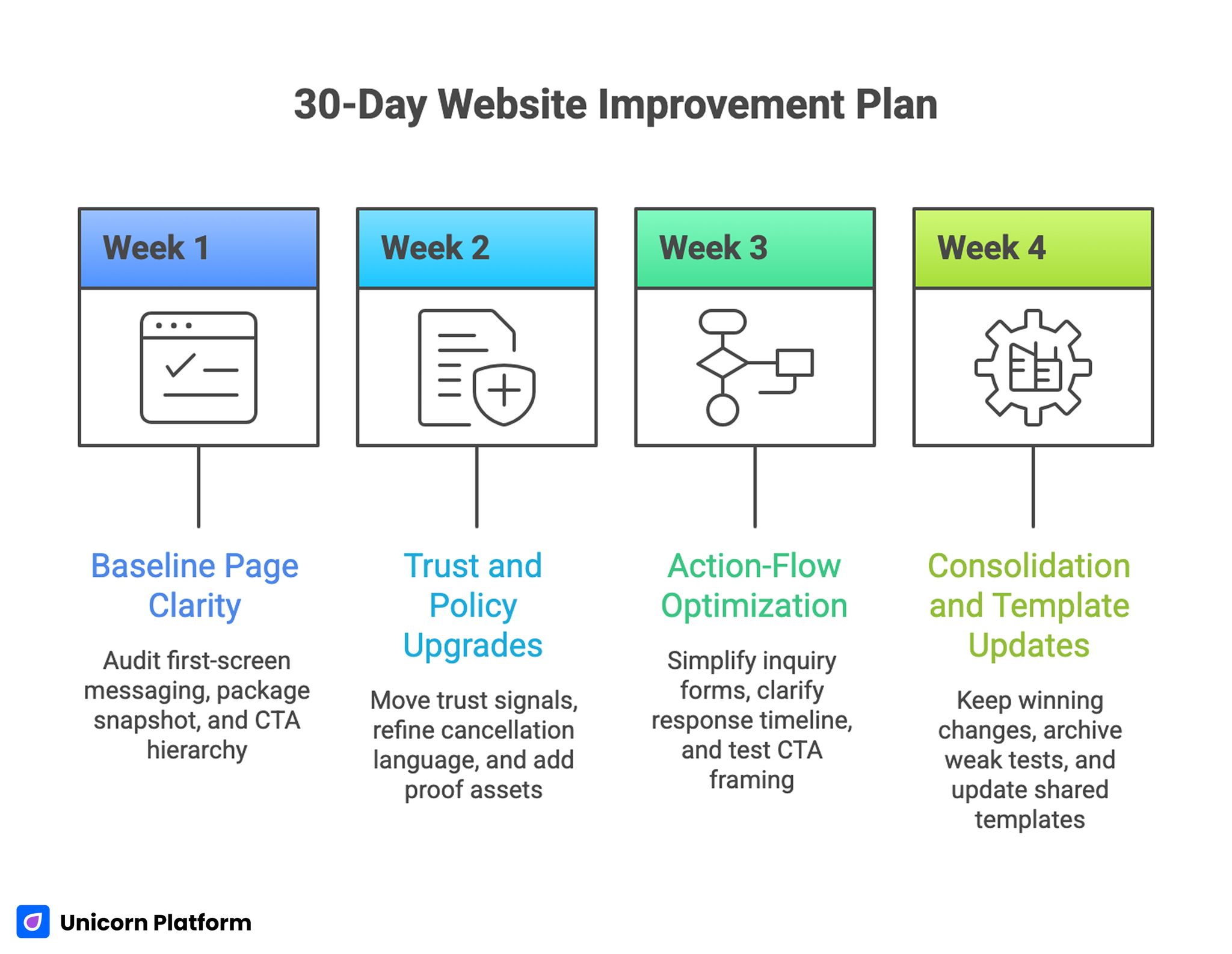
30-Day Website Improvement Plan
Week 1: baseline page clarity
Audit first-screen messaging, package snapshot logic, and CTA hierarchy. Remove vague claims and ensure traveler fit is visible immediately.
Week 2: trust and policy upgrades
Move trust signals closer to decision points, refine cancellation and support language, and add two high-quality proof assets with context. This improves confidence before users reach the inquiry form.
Week 3: action-flow optimization
Simplify inquiry forms, clarify response timeline messaging, and test one CTA framing variable tied to traveler intent. Keep other elements stable to preserve test quality.
Week 4: consolidation and template updates
Keep winning changes, archive weak tests, and update shared page templates with proven structure and copy patterns. This turns one campaign cycle into reusable progress for the next launch.
A focused monthly cycle usually outperforms occasional redesign sprints because learning is continuous and execution stays manageable. It also makes ownership clearer across content, design, and operations roles.
90-Day Scale Plan for Multi-Destination Operators
Month one should standardize core page architecture and QA rules. Month two should expand destination clusters using the same conversion model. Month three should formalize governance for proof refresh, policy updates, and experiment review cadence.
Scale should follow process reliability. Publishing more destination pages without clear standards usually produces inconsistent quality and weaker conversion trends.
Cross-functional coordination is important here. Marketing, operations, and customer support should align on what is promised on page and what can be delivered post-inquiry.
Metrics That Matter More Than Traffic Volume
Traffic growth can look impressive while booking outcomes stay flat. Teams should track deeper commercial indicators.
High-value metrics are listed below. These indicators reflect commercial progress better than traffic alone.
- Landing-to-inquiry conversion rate
- Inquiry-to-qualified-lead rate
- Qualified-lead-to-booking rate
- Average booking value by package page
- Mobile conversion gap versus desktop
- Policy page engagement before inquiry
These metrics show whether pages attract serious buyers or casual browsers. They also help teams detect when inquiry volume rises but lead quality falls.
Common Mistakes and Direct Fixes
Mistake 1: overdesigned hero with weak practical detail
Fix by adding traveler fit, trip style, and clear next action in the first screen. Users should understand whether the package matches their goals in seconds.
Mistake 2: hidden pricing expectations
Fix by clarifying ranges, tiers, or quote logic near the first decision point. Clear expectation framing reduces hesitation and support back-and-forth.
Mistake 3: weak trust placement
Fix by layering proof early and near CTAs instead of burying it at the bottom. This keeps confidence aligned with action moments.
Mistake 4: long inquiry forms with low-value fields
Fix by reducing required inputs and collecting optional details later. Progressive data collection preserves completion while still supporting qualification.
Mistake 5: disconnected content and package pages
Fix by building a deliberate internal-link structure from planning content to relevant offers. Users should always have an obvious path from research to inquiry.
Mistake 6: mobile flow treated as a final QA task
Fix by testing mobile interactions from the first draft and after every major update. Ongoing validation prevents regressions during seasonal update cycles.
FAQ: Travel Agency Website Examples
What makes a travel agency website convert better than competitors?
Strong conversion usually comes from clearer decision flow, not just stronger visuals. Users need specific package context, trust cues, and a low-friction action path.
Should travel pages prioritize inspiration or details?
They should combine both, but details must appear early enough to support decisions. Inspiration attracts attention, while operational clarity drives inquiries.
How much pricing should be shown on travel package pages?
Show enough pricing context to set expectations and reduce uncertainty. If final pricing is variable, explain what affects quotes and when responses are provided.
Is one template enough for all destinations?
One structural template is useful, but messaging and proof should adapt by destination and traveler type. Reuse framework, customize context.
How many CTAs should a package page include?
Most pages perform best with one primary CTA and limited secondary options. Too many equal-priority actions can reduce confidence.
What is the biggest travel website mistake on mobile?
The biggest issue is interaction friction around forms and date selection. Slow load and dense layout compound the problem quickly.
How often should trust sections be updated?
Monthly is a practical baseline, and high-season campaigns may require more frequent updates. Fresh proof maintains confidence and relevance.
Do travel blogs really help bookings?
Yes, when blog content is connected to package pages through clear internal pathways. Educational content helps qualify users before inquiry.
What should teams test first?
Start with hero clarity, trust placement, and form friction. These areas usually deliver the highest early impact.
How can small teams keep pace with updates across many routes?
Use modular templates, destination-specific content blocks, and a fixed weekly optimization rhythm. Consistency beats complexity for lean teams.
Final Takeaway
Travel website inspiration becomes valuable only when it is translated into a repeatable conversion system. The strongest teams evaluate examples by decision support, trust clarity, and action flow instead of visual novelty alone.
Build pages around traveler intent, make operational details explicit, and treat mobile flow as a core product surface. Then run continuous optimization with clear metrics and documented decisions.
With Unicorn Platform, teams can execute this model quickly by reusing stable structures and updating destination-specific content without development bottlenecks. That is how inspiration turns into reliable booking growth.